Every shape and color in a logo sends a subconscious message. At Design by Ching, we don’t choose elements randomly — we use visual psychology intentionally to evoke trust, energy, calm, excitement, or authority, aligning perfectly with the brand’s personality and audience.
1. The Psychology of Shapes
Circles feel inclusive, friendly, and complete. Squares and rectangles convey stability, trust, and professionalism. Triangles suggest direction, energy, or caution. Organic, irregular shapes feel creative, approachable, and human.
2. Color and Emotional Response
Blue builds trust and reliability (finance, tech, healthcare). Red sparks urgency and passion. Green evokes growth, health, and calm. Warm neutrals and earth tones feel approachable and grounded. We select palettes that emotionally reinforce the brand promise.
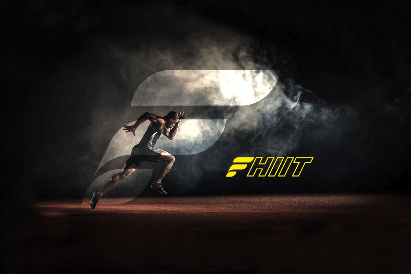
3. Combining Shape + Color for Impact
A soft blue circle feels safe and welcoming (health brands). A sharp red triangle feels bold and dynamic (sports, activism). We test combinations early to ensure the logo communicates the right feeling before a single word is read.
Want a logo that speaks to your audience on a deeper, subconscious level? Let’s design something that feels right.