


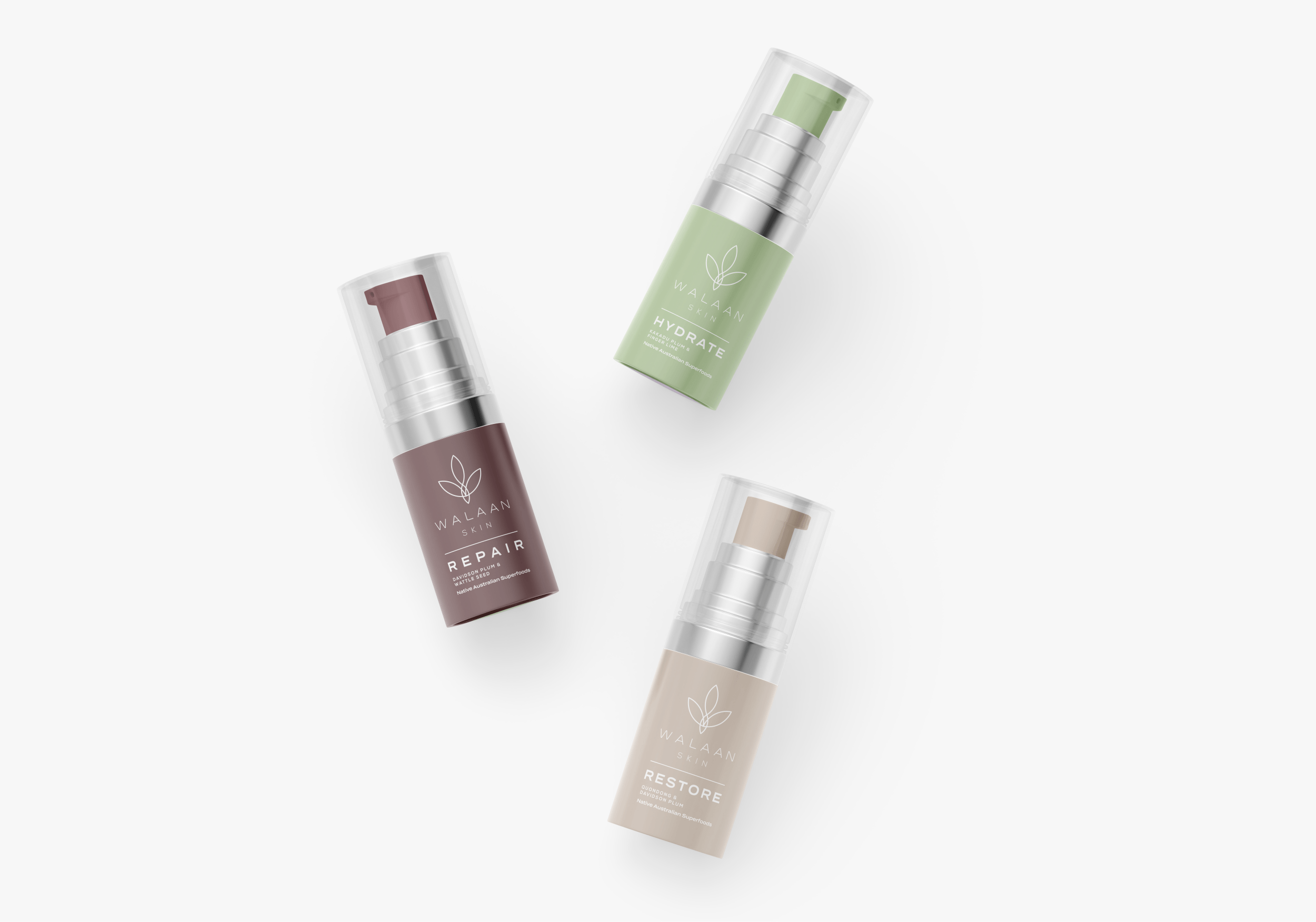


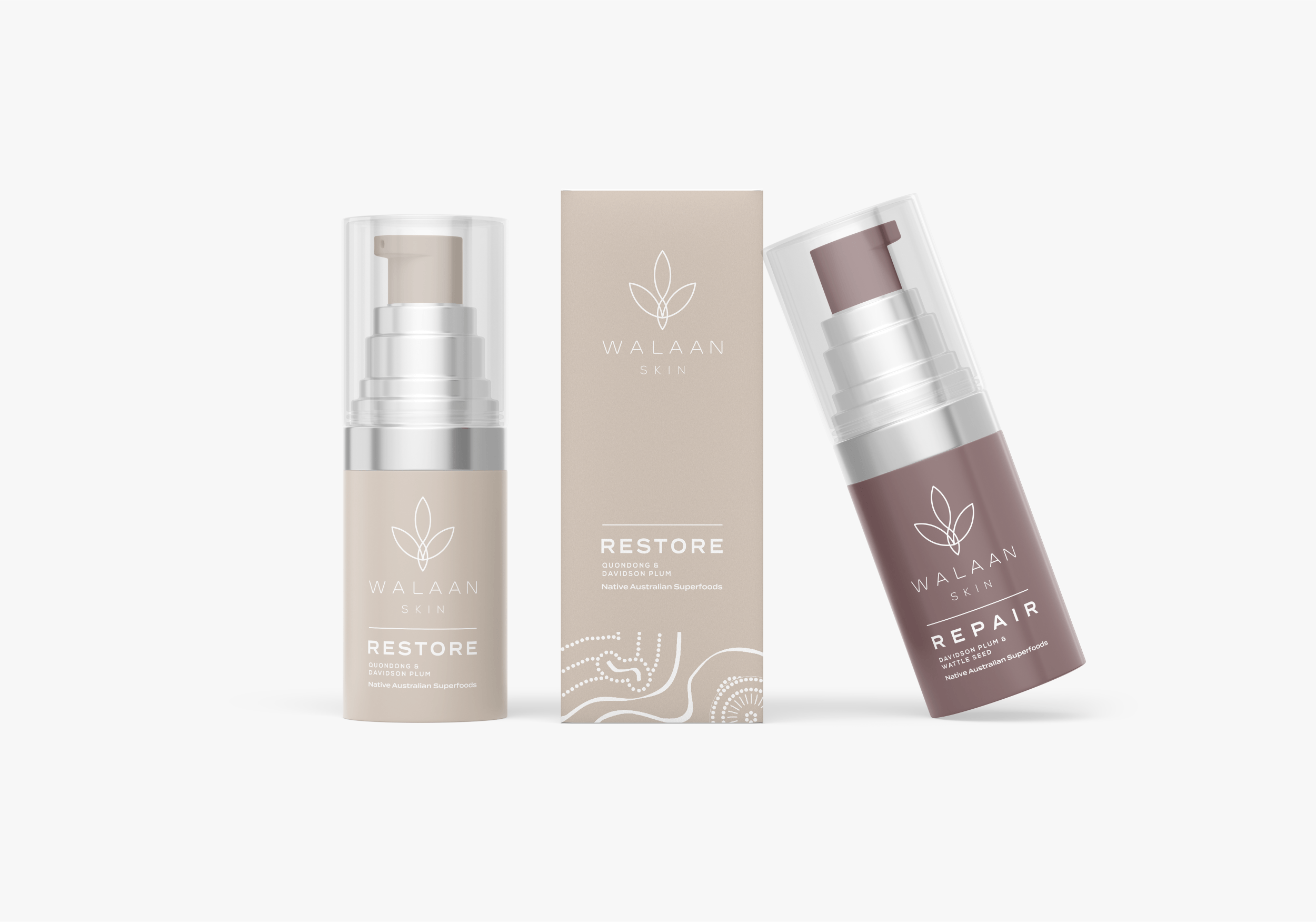
Client: Walaan Skin
Walaan Skin—We translated Walaan Skin's vision into an actionable, dynamic brand that resonated with their core values and connected authentically with their audience. Location: Sydney, Australia
Work: Logo & Brand Development + Consumer Packaging Design

Logo Thought Process
The W letter mark represents Walaan, coupled with an Emu footprint. The Emu, a large native bird endemic to Australia, plays a crucial role in the germination process for the very ingredients used in Walaan's products, which are native Australian superfoods. Meanwhile, leaves symbolize its 100% natural essence.


Custom Typeface
One of the standout elements of this project is the creation of a custom font specifically tailored to the brand's essence. This unique typeface was meticulously designed to encapsulate Walaan Skin's identity, values, and aspirations. It not only enhances the brand's logo but also serves as a visual representation of the precision, quality, and individuality that Walaan Skin stands for.
